Sunday, December 7, 2014

Journal 6


Similarity


Graphic Design

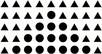
This is an example of similarity, because even though there are circles, people will see them as triangles because the triangles make up the majority of the image. People will see the circles that are shaped as a triangle and they will see the similarity and relatedness of the rest of the triangles surrounding them.


Continuation  


Logo

This is an example of continuation because the elongated letters in cursive - especially the 'C's have lines pushing the viewers eyes through the whole logo. The 'coca' part particularly stands out because it looks like its underlined, where as the 'cola' part looks like it's been bordered and almost smushed. 


Closure

Photography

This is an example of closure, because the object and line is incomplete, but the eye can conclude with what it is given, the hand is forming a lightbulb. People are able to fill in the holes that are not connected and still see a light bulb. It sort of fools the eye into seeing continuous lines on either side.


Proximity


Drawing

This is an example of proximity because the cars are placed close together and are seen as a group because they are also alike. 


Figure and Ground


Painting

This is an example of figure and ground because the horses are the same as the area around them, blending them in. But with several lines, their faces and a bit of a 3D look for the horses, people are able to see them well enough. 


Common Fate


Photogram

This is an example of Common Fate, because people's eyes will be drawn to the smooth curves that go around all in the same direction, they won't be drawn to the lines that are disconnected from the main curve. 


Journal 7


Personal/Critical: First looking at this exhibition, I was a bit confused. I saw several different women, all the photos were in black and white, then I saw black and white photos of vegetables and a bit of color photograms of vegetables. I didn't really understand the whole connection between all the subjects. So I looked at what it was about and it was about a single mother's parenting. I think this was a bit of a stretch with vegetables, especially as there is no artist statement explaining what the vegetables are doing there. But what I got from the exhibit as a whole, is this single mother's experience has been particularly hard, she has wanted freedom. Which links to the first photo, as it looks like the woman is closing her eyes and wishing for freedom. She has gone through hard times and wanted to just be done with everything. This links to the second photo I think because the knees are a bit bashed up, and the person seems to be huddled up and wanting to be alone as they cry. I think this is partly where the vegetables come in - the single mother has been left behind, hurting and kicked around, beaten and broken - just like the vegetables have been. Its a metaphor for how harshly she has been treated. I think the color photogram of the vegetable, could almost be looked at like a close-up, like actually looking at the single mother for once, seeing her for who she is, instead of judging her. A person could see she has been broken and ripped apart, but they could also see that she still has color in her. Finally, I think that over the years, after being torn down and hurt, the woman has aged and gone through some of the worst times all alone and on her own. And now she is grown, and still alone, and very sad. As depressing as this sounds, this is what I got from the exhibit personally. 

Technical: The exhibit was made up of black and white photos and photograms, they were shown in an art gallery, with several different walls for the exhibit. I think this was important, first because the gallery was downtown, so it gave the feel more of an urban and run down feel to it. Next a person could weave in and out through the walls which could almost be like weaving in and out of the single mothers life and seeing how she has lived. 

Ethical: I think the artists moral and ethical responsibilities were to capture the hardships of the single mother's trials while struggling to provide for her child all alone. I think she had to communicate to the audience that people need to stop judging single parents, as they are working the hardest they can to survive. 

Cultural: Again, I think the vegetables convey the metaphor of how hard the single mother has been pushed and shoved and ground down to the ground, and now she feels almost helpless and lost. Also the photograms take an even closer step - almost like the audience taking a closer step - and seeing how broken up the vegetable is - or how broken up the single mother is.

Historical: I think that, despite the black and white, making the exhibit look a bit older, it was quite new and a modern time period. I think this because the photos aren't very grainy, so the photos would've been taken with a digital camera. I think really the only historical point that could be brought here, might be losing the husband at war, making the wife a single mother. I say war because of the American flag in the last photo and the brokenness in all the photos, showing a great and deep sadness. 


Journal 8


For these two pieces I thought they were both a boyish playfulness and mischievousness. The top photo shows trees that have been 'TP-ed' which is a very normal prank in many cases. It also seems like a haunting painting because of the willowy trees and the dead leaves on the ground, but I think the light really makes up for that haunting feeling, and makes it seem like someone would see it while walking through the woods, happen to stumble upon it, and laugh. The next one is especially playful and mischievous, it also looks very loud and chaotic. Obviously there is a food fight going on between boys who look like they're at a boarding school, because they're in uniforms and a nice dining room. They seem to have gone crazy and are having fun just being their age again. Closer to the back, it looks like there is a teacher who is annoyed and feeling unable to keep them quiet, and trying to stop them, but failing miserably. I think one of the things that sticks out even more to the chaos is the boy at the corner of the painting. It makes me feel like I'm actually a part of the scene and he is running by me. Each of these paintings makes me feel light, giddy and mischievous. 


This photo makes me feel very uncomfortable. Starting with the angle of the picture and the blank space, I think when the photo was taken below, it made it seem like the person was coming down at the viewer and gave it an uncomfortable feel. Also the person has a very aggravating almost angry face on, its not one that's pleasant and it gives a harsh mood to the photo. Next the way the person is posed is sort of clamped up and tense, for me, this made me feel more tense as well as if reacting or mirroring the image. Also the person looks very sweaty, bruised and bloody, it looks painful and not very clean. Finally I think the most uncomfortable part for me was the hair in the armpit, this person looks more like a girl as they have a wrap, but she also has her hair cut like a boy. I think the armpit hair made me feel dirty and unclean. The photo as a whole was unsatisfying to look at and not very appealing in feel. 


I thought this was a very bland and simple look to it, but it gave it a nice and pleasant feel to it. First there are flower shapes that are scattered around and they are in a perfect square as if being in a frame  even though it wasn't. Also all the flowers were a monochrome color such as black, grey and white in a few different shades. I think the similar colors and the simple shape gave it a nice and pleasant feel to it that was satisfying to the eye and definitely not overwhelming or underwhelming. 

Journal 5

Shock Advertising 

I would not say this is exactly an ethical piece, I looked up United Colors of Benetton, and all I could find was an online clothing store, so I don't think they would be the most ethical of sources for an equality advertising. 
I think this is appropriate because it is showing that all people have the same heart, we can't judge them by their skin, we are literally the same when it comes down to physical beings. We each have hands, arms, legs feet, and hearts.
This is simply saying, people are the same, no matter what skin color, so we should actually treat each other the same. I think it is propaganda because it is one sided and it is using a shock theme to convince people of something.
I think the moral issues that United Colors of Benetton is trying to show is people are seeing others as bad or different because they look different, UCOB is seeing this as a moral issue because we need to stop judging.


Shock Advertising
This is definitely ethical because it is advertising about violent games and was made by a very large and very known game corporation - PSP (Play Station Portable)
I think it is appropriate because it shows how a person could be killing someone in a game, but they're really hurting themselves.
This is an advertisement by PSP and it is sharing how violent games can dull someones sensitivity of violence. They start playing these games and even watching violent movies and shows and they don't realize the harm they are causing themselves in doing so, and also that it really happens. I also think that it is showing how people need to get off their video games and actually talk with real people. I think this is propaganda because it is one sided as I'm sure not all kids who play or watch violent things turn out messed up like this.

I think the moral issue here is that people are being desensitized by violence that is constantly around them.


Contemporary Propaganda
I don't think this is a very ethical piece, the LaRouche is a political and cultural movement that is sponsoring Lyndon LaRouche, who is a politician that started the LaRouche Movement, so this is all opinionated by one group.
I don't think this is very appropriate because it is comparing the President with Hitler, but I also do think it is appropriate because they are showing how strongly they feel about him with propaganda which is always one sided. Also they are using his propaganda statement "Change" to share their opinion that he as a person has changed for the worse for the country.
I think this is showing that President Obama has changed America and become very wrongly minded in his choices for the country, also since it is a LaRouche poster, they are saying to join the LaRouche movement. I think it is a propaganda because it is very one sided, mocking and telling people to follow other someone else's choices.
The moral issue here is people are thinking Obama has not changed America for the better, but for the worse as a whole.


Contemporary Propaganda
I think this is an ethical poster because it was created by the company that is creating the "Redolution".
I think it is appropriate, because it is showing that there is a 'war' between the m&ms and they are giving a sort of vintage look to support the propaganda poster for the red m&m team. 
This is a propaganda poster for a war between m&ms, it is also sponsoring that a person could win money by voting online. I think this is propaganda because it is clearly one sided. It has mostly red colors, says vote red and says 'The Redolution is on', telling the audience to vote for the red m&m and getting them excited about the chance to win money.
I think the responsibility the producer has for this poster is to support the red sided m&m in the 'war' and also get people excited about the possibility of winning money.